CoG’s Website Featured in Prestigious Typographic Design Publication
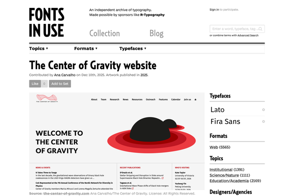
The Center of Gravity’s website has been featured in “Fonts in Use”, a prestigious archive showcasing the best examples of typographic use in design. With its carefully curated selection and emphasis on practical applications of typography, the archive has become a popular resource for designers and typography enthusiasts.
From its conception, the CoG’s website was designed with a dual mission in mind: to be a rigorous resource for the professional physics community while also providing the general public with a place to access the Center’s research and work in a clear and engaging manner. These requirements dictated not only the visual language of the website but also the choice of fonts in use here: Lato Bold (designed by Łukasz Dziedzic) for the main titles and Fira Sans (by studio Carrois Apostrophe) for the secondary titles (Fira Sans Bold) and the copy text (Fira Sans Regular).
The website was designed by our long-time collaborator Ana Carvalho and the web development was carried out by João Vasconcelos.
Dec. 17, 2025, 12:26 p.m.